OVERVIEW
One of the most important aspects of designing an ATM touch screen is to ensure that the interface is accommodating for all ages. A key consideration when creating the ATM interface is to make it user-friendly by incorporating clear and straightforward instructions that make the operation of the machine much easier. It is also necessary to have a simple navigation system that ensures that customers have no difficulty in finding the desired features. Additionally, it is crucial to consider the specific needs of the elderly by making the icons larger and more visible, thus simplifying the operating experience for them.
Though I began my academic and professional journey in computer engineering , i ultimately found my passion in field of designing.Through my experiences thus far, I have come to realize that my ability to empathize with others is a significant asset. By understanding the thoughts and perspectives of those around me, I believe I can make a meaningful contribution within a UX team.
KEY PERFORMANCE INDICATOR
Ease of usage in terms of navigating between screens. Time on task (the time required to complete a task of withdrawal, deposit, and balance inquiry) should be minimized.
I can create visually compelling PowePoint presentations or can help you redesign the slides which wil not only be visually stunning but also engaing and persuasive.
DESIGN PROCESS
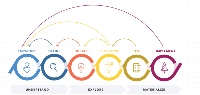
ATM FUNCTIONS OF USERS
- Entering a PIN to access the ATM
- Fast cash withdrawal in these amounts : 20,40,60,80,100
- Withdrawal in any amount
- Deposit amount
Check Account balance
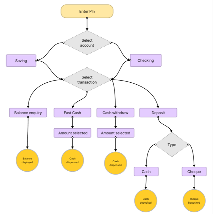
User flow
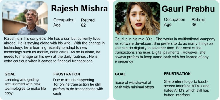
User persona
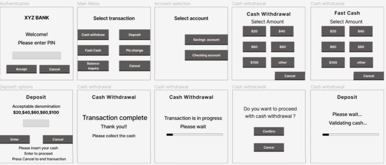
Mid-fidelity wireframe
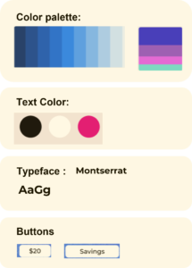
Design system
Hi-fidelity wireframe
Solutions incorporated in design
1)I applied the ‘Principle of Consistency’ when designing the UI of the ATM in terms of colors, buttons, and patterns. This helps reduce the cognitive load on the user’s brain.
2)Adhering to the principle of “ Match between system and real world” , wherever possible I introduced images and icons for user to easily navigate between the screens.
3)I tried shifting the touch points(selecting amounts, confirmation of transactions, main menu options) to the center of ATM screens instead of normal left and right alignment . So that it would be within User’s central vision instead of peripheral vision
4)For every touch points on screen a small beep should be there , so that User especially old aged , will be sure that they have correctly touched the screen.